“…it is really not a theory at all. Nothing can be predicted by means of it. It is, rather, a vague schematic outline…”
Ludwig Wittgenstein, Remarks on Color
Before I encountered any kind of color theory in school I remember a lesson in primary school about how to properly use color in the household. The essence of it was which colors go together well and which don’t. Brown and blue were a big no-no, while blue and red were fine. Based on what exactly? I didn’t have the faintest idea (not that I actually asked myself). It’s all pretty much geared toward cultural notions of tasteful, harmonious and beautiful as opposed to garrish, discordant and ugly. But is there anything more substantial to it apart from the collective taste? Hardly.
Color theory includes a disparate array of texts, from casual notes to serious scientific and philosophical volumes, which try to make sense of color, and where colors are classified, explained, harmonized and systematized. From our XXI century point of view we might freely conclude that such attempts don’t produce many consistent results due to the extremely elusive nature of the aspect of visual perception that we call color. Nevertheless, the difficulty of defining color did not discourage a great number of thinkers, artists, mystics, scientists, philosophers, chemists and manufacturers to try to come up with their own system for making sense of our usage of color.
Early Color Theory History
In early writings color is thought of as material and not some abstract add-on. It was usually a natural material (rock, wood, leaves…) or a pigment or dye. Aristotle in De Coloribus (IV century B.C.) mentions that all colors come from the mixture of light and darkness, from black and white. And red sits right in the middle. The red of the sunset is a mixture of day (white) and night (black). Fire was supposedly white, but it turned yellow and red due to the blackness of the wood.
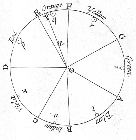
A great breakthrough came with Sir Isaac Newton and his work, ‘Opticks’, from 1704. A major portion of the argument is based on his famous experiment with the refraction of light through a glass prism. This was the first time that color was considered to be the quality of light. Newton saw seven distinct colors in the rainbow projected on the wall, probably due to the popularity of the number seven as a divine number. What’s more, he was the first to use the word, spectrum, and the first to hammer that obviously linear spectrum into a circle, the very picture of completeness and divine perfection.
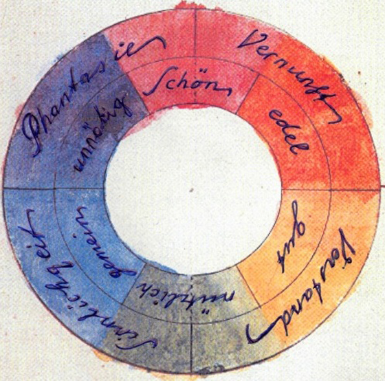
A whole century later, Johann Wolfgang Goethe challenged Newton’s scientific view with his ‘Theory of Colours’ (1810), based on his own observations. This was another breakthrough because he considered color to be a perceptual phenomenon and not just an objective and easily measured quality of light. As quoted at the beginning of this post, Wittgenstein said that Goethe’s theory was not a theory at all. It was more of a portrayal, not an explanation, based on countless observations of gathered material that Goethe undertook over the years. Still, colors were still in a circle evenly distributed based on opposing complementary pairs that were derived from the observation of the afterimage (yellow produced a purple afterimage, green was coupled with red, etc.).
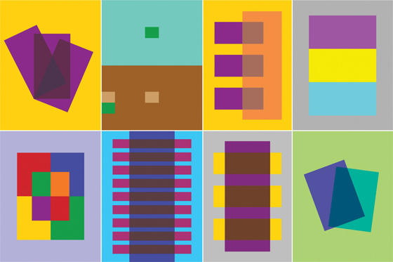
From Goethe onward we have seen numerous attempts that swing from an objective to a subjective approach. French chemist, Michel Eugène Chevreul, introduced the idea of simultaneous contrast where the perception of a color depended on the context. An identical red looks different surrounded by light yellow than with dark blue, for instance. Scottish physicist James Clerk Maxwell, on the other hand, talked about universal rules set in stone, but he also introduced numerous ways of mixing color. Both men were vastly influential on Impressionist and Post-Impressionist painters.
Introducing Munsell
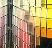
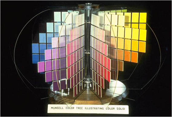
Searching for the essence of color and harmonies is all very nice, but the industrial revolution needed standardization. The demand for exact color reproduction and classification became paramount. Albert H. Munsell invented a system for organizing and naming colors based on his ‘A Color Notation’ from 1905’. His color tree was a comprehensive system of arranging colors in comparison to previous attempts such as the sphere, cones, circles and others. The usual color names were abandoned — Munsell considered them “foolish” and “misleading” — and the alphanumeric notation was introduced. Every Munsell color can be found within the tree, in accordance with its chroma, value and hue. The information about color can be conveyed without noise and the color can be faithfully reproduced. Practical, neat and invaluable for the development of industry. The idea of universality of color was abandoned and colors were manageable only within a well-defined system, like a coded message. If we both have the same swatchbook we will know exactly what color we are talking about.
What is Color?
Standardized colors have taken on a life of their own and many other systems have appeared like Ostwald and Pantone. But the search for the soul of color and perfect harmonies hasn’t stopped. Wassily Kandinsky explored analogies between colors, shapes, music and psychological states. His approach was heavily influenced by then fashionable mysticism, but regardless of his unscientific method, he was seeking a well-defined and orderly system. “Colour is the keyboard, the eyes are the hammers, the soul is the piano with many strings. The artist is the hand which plays, touching one key or another, to cause vibrations in the soul”.
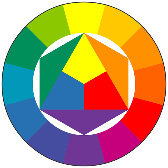
His Bauhaus colleague Johannes Itten was responsible for the color wheel and its accompanying harmonies which are still taught in basic art courses. Color definitions, mixing and matching were guided by strict mathematical rules, not for the first time. Three primary, three secondary and six tertiary colors, with harmonies based on round-numbered angles. I remember when we were supposed to recreate Itten’s color wheel in school. I could never get the “right” purple by mixing blue and red so I cheated by adding fluorescent red. It doesn’t take much to realize that there’s something fishy about the whole system.
Another Bauhaus teacher, Josef Albers, published his famous “Interaction of Color” while teaching at the Black Mountain College in the 60s. Again we’re back to Chevreul’s logic of color relativity. Color never exists as a separate entity and its very nature is that it changes based on the context.
None of the theorists have been able to answer the question, “What is color?” Or to be more precise they have all given different answers. Color is light, pigment, material, idea, aspect of visual perception, message… It depends on the era and the color authority of the moment. It’s not about the actual theories, but about the rich diversity in approach. The same goes with the color matching. Even if we know how absurd it is, we don’t stop seeking those pretty harmonies and palettes. After all, people crave guidance when matching socks with suits, and toasters with kitchen tops. But the closest to the truth that I ever got was, “There is no such thing as mismatching colors”.
About the Author
 Aleksandar Macasev is a visual artist and graphic designer who lives and works in New York City. Everything about the Chromapost project can be found at www.chromapost.com. He invites you to join the Chromapost Social Network at www.chromapost.net, where users can post colors based on their emotions and create art out of it.

Leave a Reply