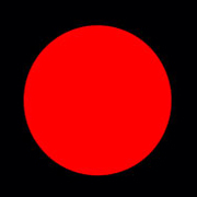
A couple of months ago I suffered from a pretty exhausting viral infection. Every half-hour I found myself with one of those Vicks thermometers in my mouth waiting to see what color the little round display would show. I didn’t pay any attention to the actual numerical temperature reading. If it turns red I’m gonna die and where’s the closest ER. Yellow, OK I might survive. Green, phew.
In my feverish haze none of the other symptoms mattered, just that little circle under my nose. The color is coded in this particular context, so color alone is able to send a very powerful and straightforward message to which we might have a very strong emotional reaction. Color coding in diagnostics can be pretty unnerving. A single color tone tells you that you are OK or that you’re not, and you might cringe every time you see it regardless of the context.
I Saw the Signs
Our ability to respond immediately to signs of danger is deeply wired into our psyche. See the warning sign, react without thinking and survive. Modern society exploits this instinct extensively. When you see a red traffic light you just stop without thinking. Position of the light, shape, and intensity are included in the message too, but not as nearly as much as the color. That dangerous threatening red color, according to Berlin and Kay’s seminal work on the evolution of color terms, ‘Language… Why That Color?’, is recognized in many languages and cultures immediately after the basic division of colors into dark and light, or black and white if you like.
Red seems to stand out best on any background and due to many natural associations we see it as danger. (Relaxed musing about the pretty blue sky came much later). The sight of blood was often accompanied by death, the fiery red sky of dusk would warn us of the approaching night full of terrors, and the red fire would burn and destroy. But wait, fire is never actually red. It doesn’t matter. Even a small hint of red like in burning coals would paint the whole affair red. Ironically, the red side of the spectrum of visible light is physically ‘colder’ than the blue-violet side because its electromagnetic waves have lower frequency. That doesn’t prevent us from thinking of red as hot and blue as cold. It’s never so much about what is real, but rather about our perception of the real.
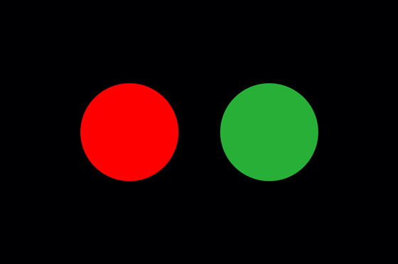
Since the first gas traffic light in London and later the first electric traffic light in Salt Lake City, red was paired with the opposing green. Today almost anywhere in the world there is no doubt about which color means what. Even the wrongly infamous Japanese blue traffic light, instead of the standard green, is actually standard green. ‘Aoi’ is the color term that covers both shades of blue and green and it is used to describe the green traffic light.
From Color Coding Systems to Color As a Guide
According to Victoria Finlay’s book, ‘Color: A Natural History of the Palette’, one of the earliest color coding systems was found in Peru among the remains of the Inca empire. Relay teams of runners would carry multicolored cords full of knots as messages. Each knot and color meant something different. In many forms such an efficient way of message transmission remained to this day. A simple and preferably unambiguous message is attached to the color and if you know the code the whole thing can be read at a glance. If you know the code. You know those bomb scenes in movies where the hero has to defuse the bomb by deciphering whether to cut the red or the blue wire…. Or the confusion at the airports during those Homeland Security alerts. Red and green, pretty clear, but blue, yellow and orange… people didn’t quite know what to make of those no matter how many times they had seen the color chart. And I hope that all the medical personnel know their color codes (blue, red, pink, amber… you name it) because I have no idea. If the meaning you attach to a color doesn’t rely on already formed layers of cultural symbology (red=danger, green=relax) it is hard to find your way around if you don’t know the whole code.
Contemporary visual communication generally relies on colors as guides. Maps, websites, technical diagrams, safety instructions, charts, learning tools, etc… Colors might not give you the exact information every time, but they will at least group the information for you and gently guide you toward what you need. Think of the New York Subway system. The color of the line will give you a general idea where you’re going, but only the number and letter will give you the precise information. Such a subtle color guidance might enhance the experience of a website (see Guardian or Huffington Post). On the other hand I have noticed that due to our speedy way of life, we often consider color as the full message. It happened more than once that without paying much attention, I tapped on the Dictionary or Facebook app icon instead of the Weather app. They are all overwhelmingly blue and that’s all I care to remember about them among the many other glossy icons on my iPad.
Color Coding Emotions
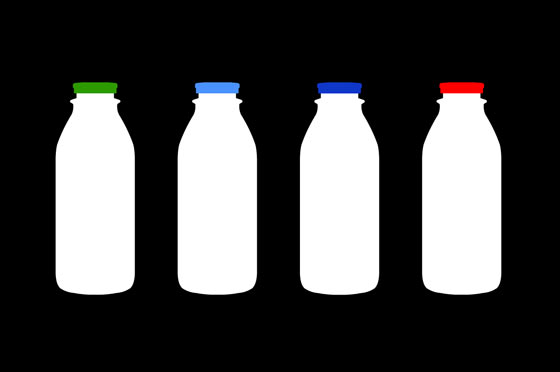
It is easy to form an emotional bond to a color just based on its assigned meaning. How much panic can a ‘blue screen of death’ induce if you use Windows PC? Or the other way around, we could form an opinion about a concept just because of the color, a mechanism thoroughly exploited in commerce. A color coded package can give us the idea at first glance what’s inside. Orange, blueberry, kiwi, strawberry… Through sophisticated branding and communication color is used to communicate more subtly a variety of other values. Think of color labels telling us about the amount of fat in virgin white milk. Green, naturally, goes to 0%, light and dark blue to 1-2% and that dangerous ‘you’re gonna get fat and have your veins clogged’ red for whole milk. There are many winding paths in this area and I’ll leave the role of color in commercial strategies for the next post.
Color as an almost telegraphic mean of communication is vastly exploited in contemporary graphic design. I like to view this in the light of the ‘golden age’ syndrome. We live in fast times and the message has to be transmitted instantly and effectively, while on the other hand there’s this ubiquitous nostalgia for the bygone quieter eras. With only a few carefully chosen colors, we can convey the feeling of the Victorian era, Art Deco, Mad Men 60s or neon 80s. Many websites and online design communities offer user-made palettes for your desired retro look or any other look. Instagram can turn any snapshot into a quazi-nostalgic masterpiece with the help of finely tuned color filters. Being aware of our instantaneous consuming habits and culturally trained minds, graphic designers make liberal use of extreme reductionism. Art masterpieces, superhero costumes and famous brands get reduced to a few colored squares becoming signs unto themselves.
But seldom do we stop and think what those colors actually mean. And what’s more, what they mean to us.
About the Author
 Aleksandar Macasev is a visual artist and graphic designer who lives and works in New York City. Everything about the Chromapost project can be found at www.chromapost.com. He invites you to join the Chromapost Social Network at www.chromapost.net, where users can post colors based on their emotions and create art out of it.

Leave a Reply